The logomark combines three key ideas into one: a smiley face for friendliness, a house to represent home, and a wrench to symbolise tools and DIY. This created a distinctive icon that communicates warmth and purpose at the same time.
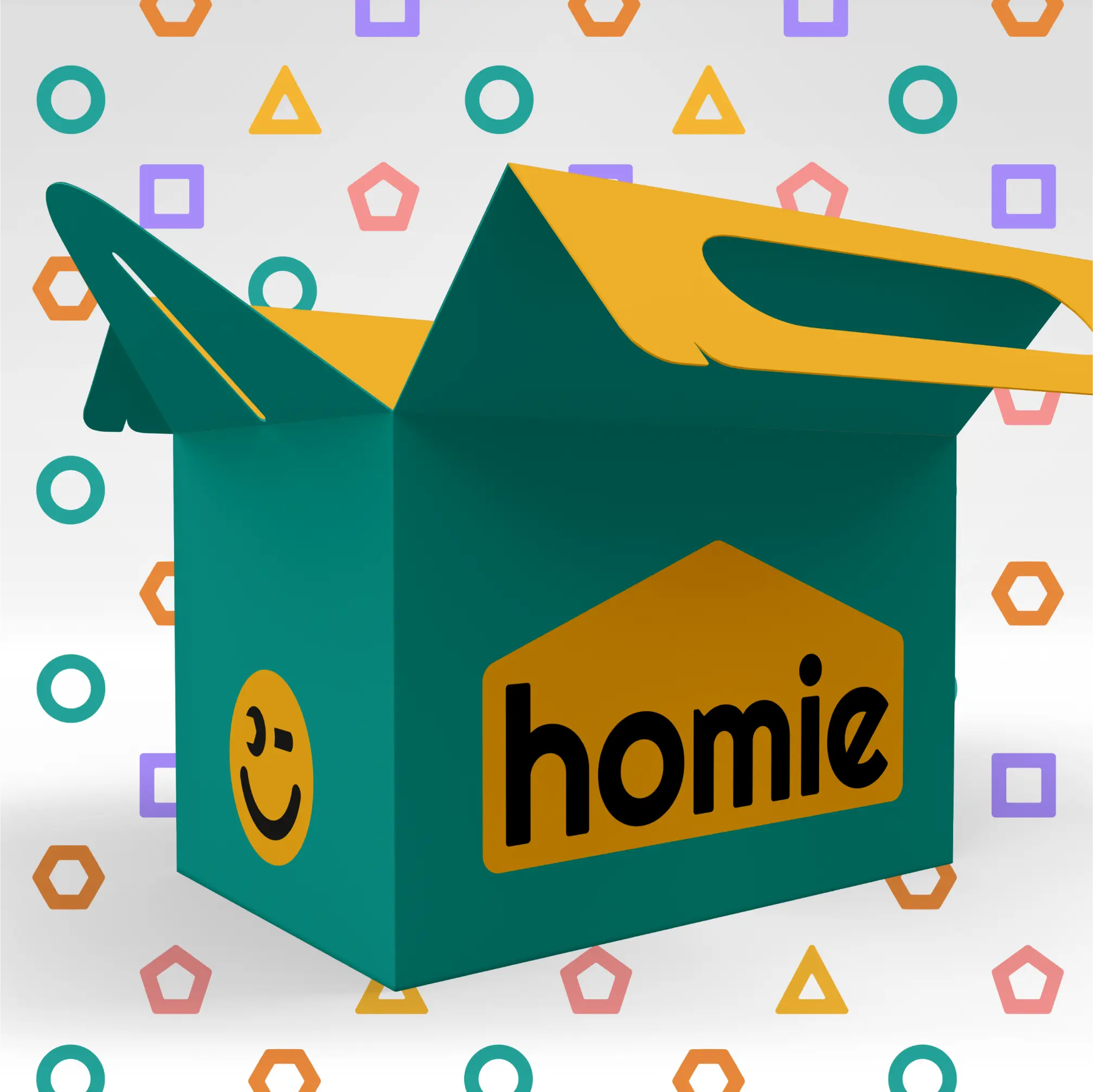
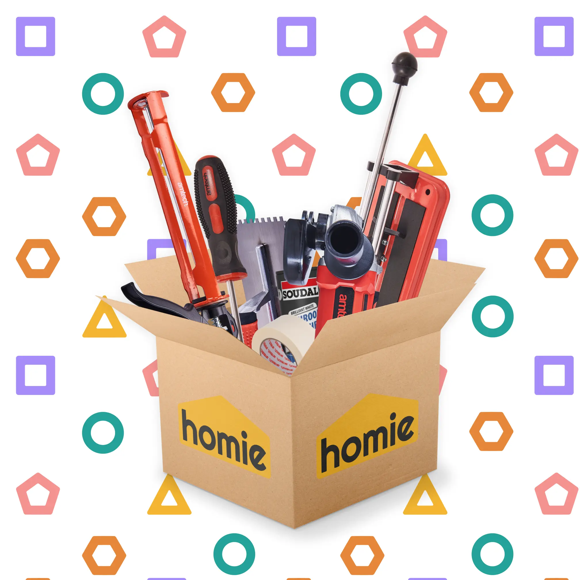
A supporting logo was created specifically for packaging, displaying the logotype inside a house shape to reinforce the theme of home. The colour palette used bold, optimistic tones for primary branding and lighter secondary colours for variety. A series of smiley icons in different colours and shapes represent values like variety, expertise, quality, convenience, and seamlessness.
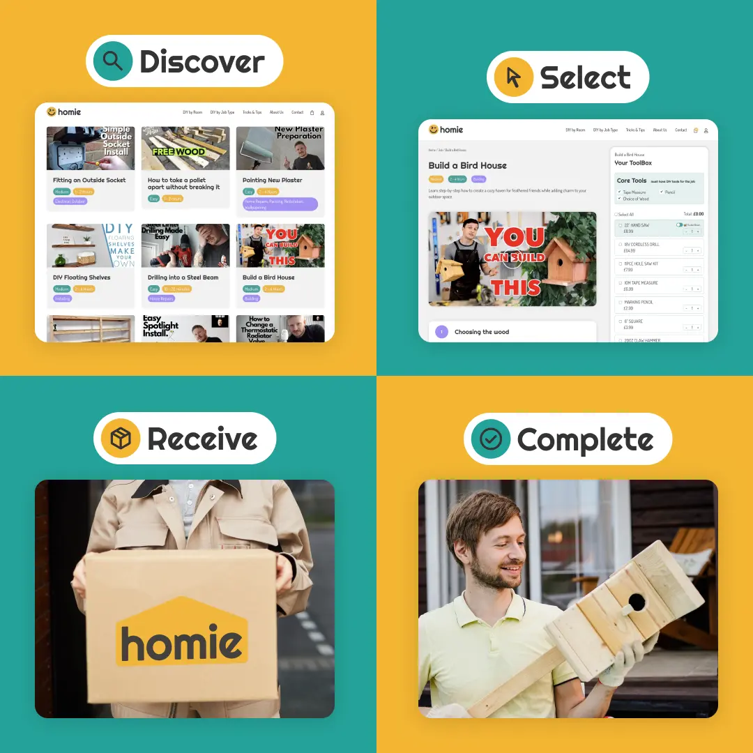
Together, the identity system makes Homie feel welcoming, fun, and reliable while staying versatile enough to work across packaging, stickers, and digital touchpoints.