Paid social creative designed to drive app installs and support sign-ups for a regulated options trading app, using clear, direct messaging to reduce friction and improve efficiency.
Client —
Investa
Industry —
Fintech
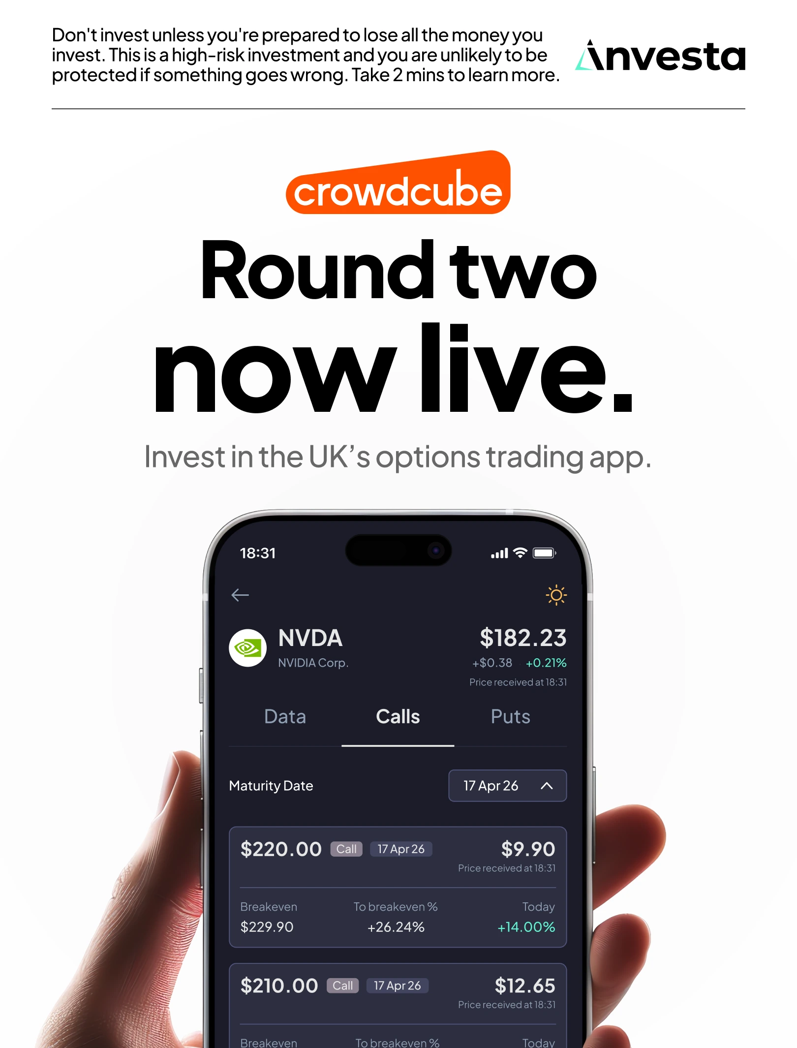
Investa is a UK-based options trading app operating in a highly regulated financial category. The objective of the campaign was to drive app installs and encourage users to sign up within the app, while building trust and clarity in a space that can feel complex or intimidating.
Paid social was a primary acquisition channel, with creative running across Meta in static formats. The challenge was to communicate what the product offered in a way that felt credible, compliant, and easy to understand, while competing in a crowded financial advertising environment.
Paid social was a primary acquisition channel, with creative running across Meta in static formats. The challenge was to communicate what the product offered in a way that felt credible, compliant, and easy to understand, while competing in a crowded financial advertising environment.
The strategy
The strategy focused on reducing friction at the top of the funnel by clearly stating what the product was and who it was for. Rather than leading with abstract value propositions or lifestyle-led messaging, the emphasis was on clarity, category definition, and availability within the UK market.
Creative testing explored different headline directions, including feature-led messaging, lifestyle-led executions, and stock-specific references. All creative needed to work within strict compliance requirements, with risk messaging clearly visible across formats and a clear path from install to sign-up.
Creative testing explored different headline directions, including feature-led messaging, lifestyle-led executions, and stock-specific references. All creative needed to work within strict compliance requirements, with risk messaging clearly visible across formats and a clear path from install to sign-up.


My role
I worked as a digital designer focused on paid advertising. Strategy and testing direction were set in collaboration with the media buyer, and I contributed to copy development and headline ideas within that framework.
My role was to execute and iterate static paid social creative across Meta, testing multiple headline variations, layouts, and visual approaches. I was responsible for designing the ads, applying copy clearly and consistently, and adapting creative based on performance feedback.
My role was to execute and iterate static paid social creative across Meta, testing multiple headline variations, layouts, and visual approaches. I was responsible for designing the ads, applying copy clearly and consistently, and adapting creative based on performance feedback.


The approach
We tested a range of creative directions to understand what resonated most strongly with prospective users. This included more expressive lifestyle imagery, feature-led messaging, and stock-specific headlines that referenced individual companies available to trade.
Performance showed that simple, direct messaging consistently outperformed more complex or expressive routes. Headlines that clearly stated the product and market, such as “Trade options in the UK,” proved particularly effective at driving efficient app installs and supporting sign-ups within the app. This approach reduced ambiguity, answered key user questions upfront, and aligned well with the regulated nature of the category.
Based on these insights, creative direction shifted towards bold, minimal layouts with clear hierarchy, strong typography, and prominent calls to action. Product UI was used to support credibility, while lifestyle imagery was used selectively to add context rather than lead the message. Compliance messaging remained visible and consistent across all executions.
The result
The campaign demonstrated that clarity and restraint were more effective than expressive or feature-heavy messaging in this category. Direct, category-led creative contributed to improved efficiency in driving app installs and supported stronger sign-up rates within the app.
By focusing on simple language, clear visual structure, and reduced cognitive load, the ads helped lower barriers to entry for new users and reinforced trust in a regulated environment. The work showed how disciplined creative execution, informed by testing, could support performance across both acquisition and activation stages.
By focusing on simple language, clear visual structure, and reduced cognitive load, the ads helped lower barriers to entry for new users and reinforced trust in a regulated environment. The work showed how disciplined creative execution, informed by testing, could support performance across both acquisition and activation stages.