Paid social creative developed to strengthen brand presence, build emotional connection, and support seven-figure quarterly revenue across Meta campaigns.
Client —
Snapfish UK
Industry —
Ecommerce / Photo Printing
Snapfish is a high-volume ecommerce brand operating in a competitive and highly seasonal market, where paid social is a primary revenue driver across the UK. I worked as the sole designer on the account, collaborating closely with the media buyer to develop static paid social creative that supported a wider mix of video and UGC-led content. My role focused on improving the effectiveness of static creative within this ecosystem, contributing to campaigns generating multi-million pound revenue across key periods.
The strategy
The strategy focused on moving away from generic ecommerce creative and towards stronger brand application and emotional storytelling. Snapfish products are personal by nature, so static creative needed to reflect real moments, memories, and relationships rather than purely transactional messaging.
The aim was to improve creative effectiveness within the static ad format while maintaining efficiency as spend increased across key seasonal periods. Creative needed to feel authentic and emotionally engaging, while remaining clear, scannable, and supportive of conversion alongside motion-led assets.
The aim was to improve creative effectiveness within the static ad format while maintaining efficiency as spend increased across key seasonal periods. Creative needed to feel authentic and emotionally engaging, while remaining clear, scannable, and supportive of conversion alongside motion-led assets.
My role
I was the sole designer responsible for static paid social creative on the Snapfish account. I worked closely with the media buyer to develop concepts that aligned with campaign objectives and complemented video and UGC content running in parallel.
My role focused on creative concepting, static ad design across Meta placements, and consistent brand application. All static concepts were designed to scale and were handed over for animation where appropriate.
My role focused on creative concepting, static ad design across Meta placements, and consistent brand application. All static concepts were designed to scale and were handed over for animation where appropriate.
The approach
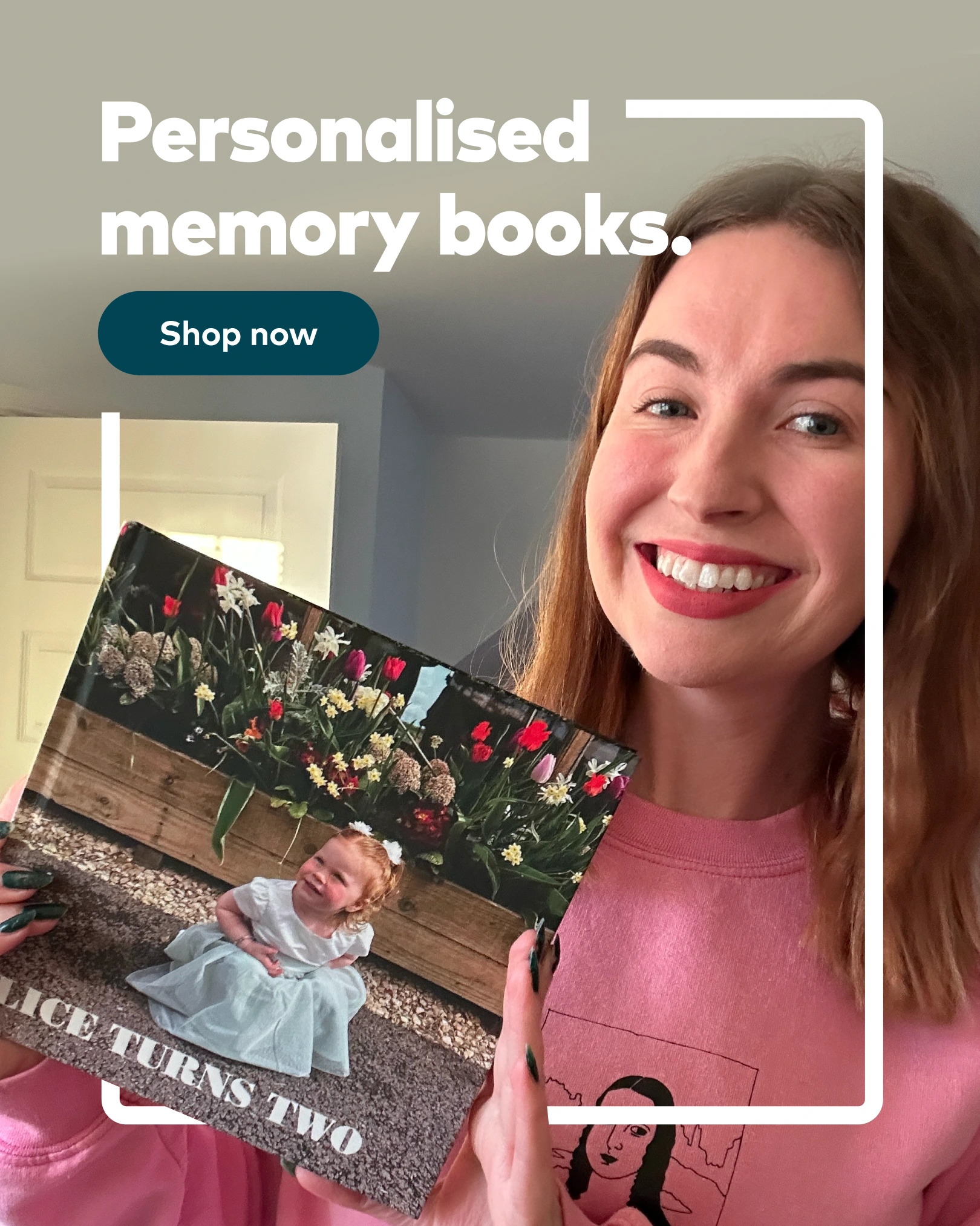
Performance insights showed that static creative using authentic, emotionally resonant imagery consistently outperformed more generic ecommerce formats. Based on this, I shifted creative direction towards UGC-style visuals that felt real and relatable, while applying stronger and more confident brand consistency across all executions.
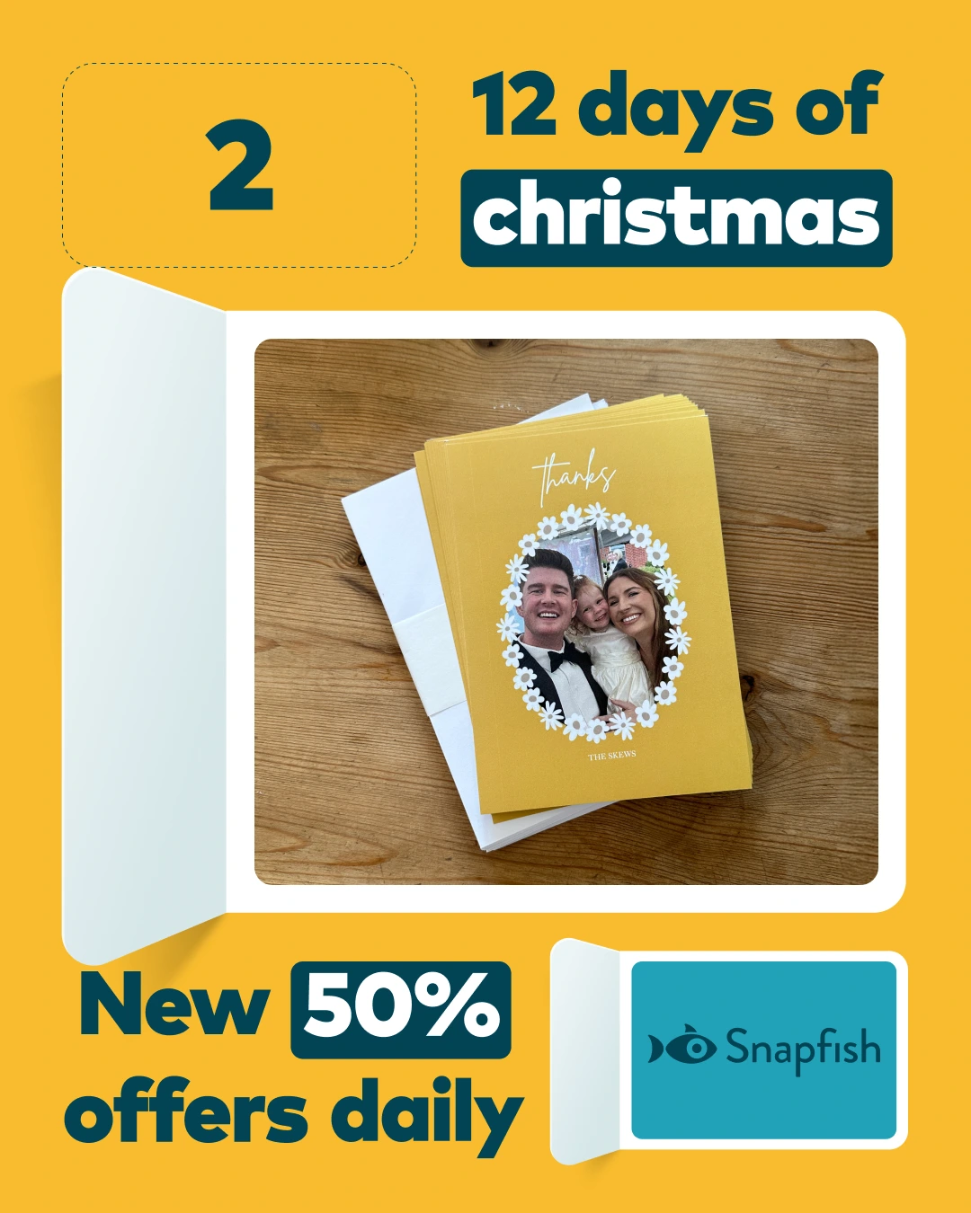
One standout execution was a wrapped-style creative concept inspired by familiar annual recap formats. This reframed Snapfish products as a way to reflect on meaningful moments, positioning the brand around emotion and memory rather than focusing purely on the physical product.
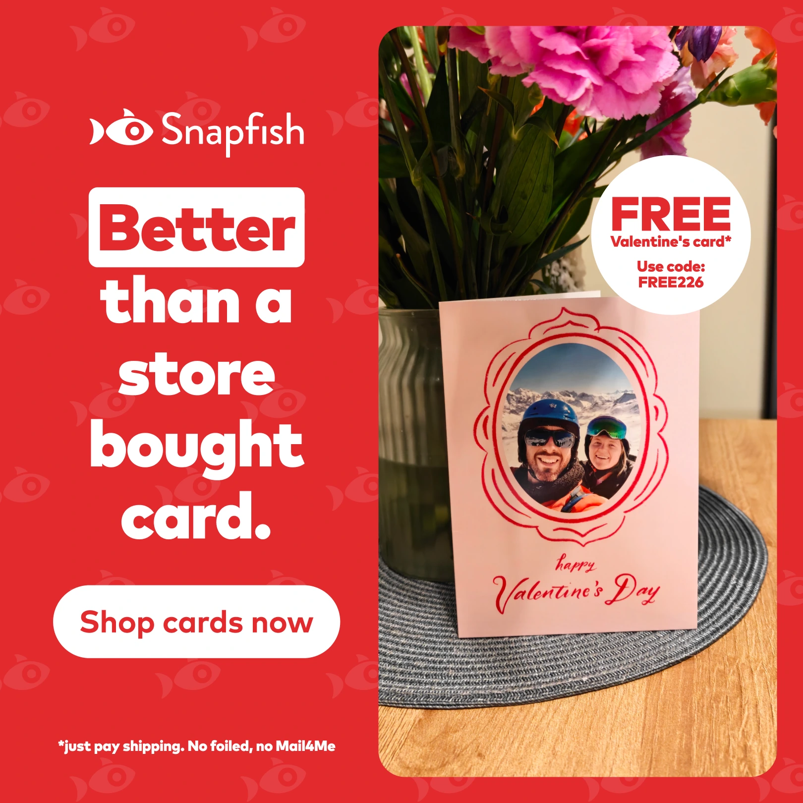
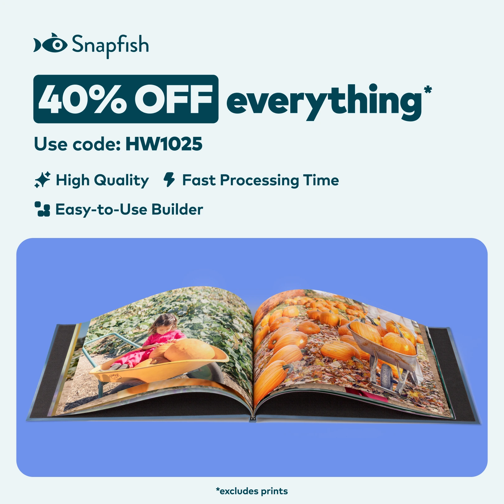
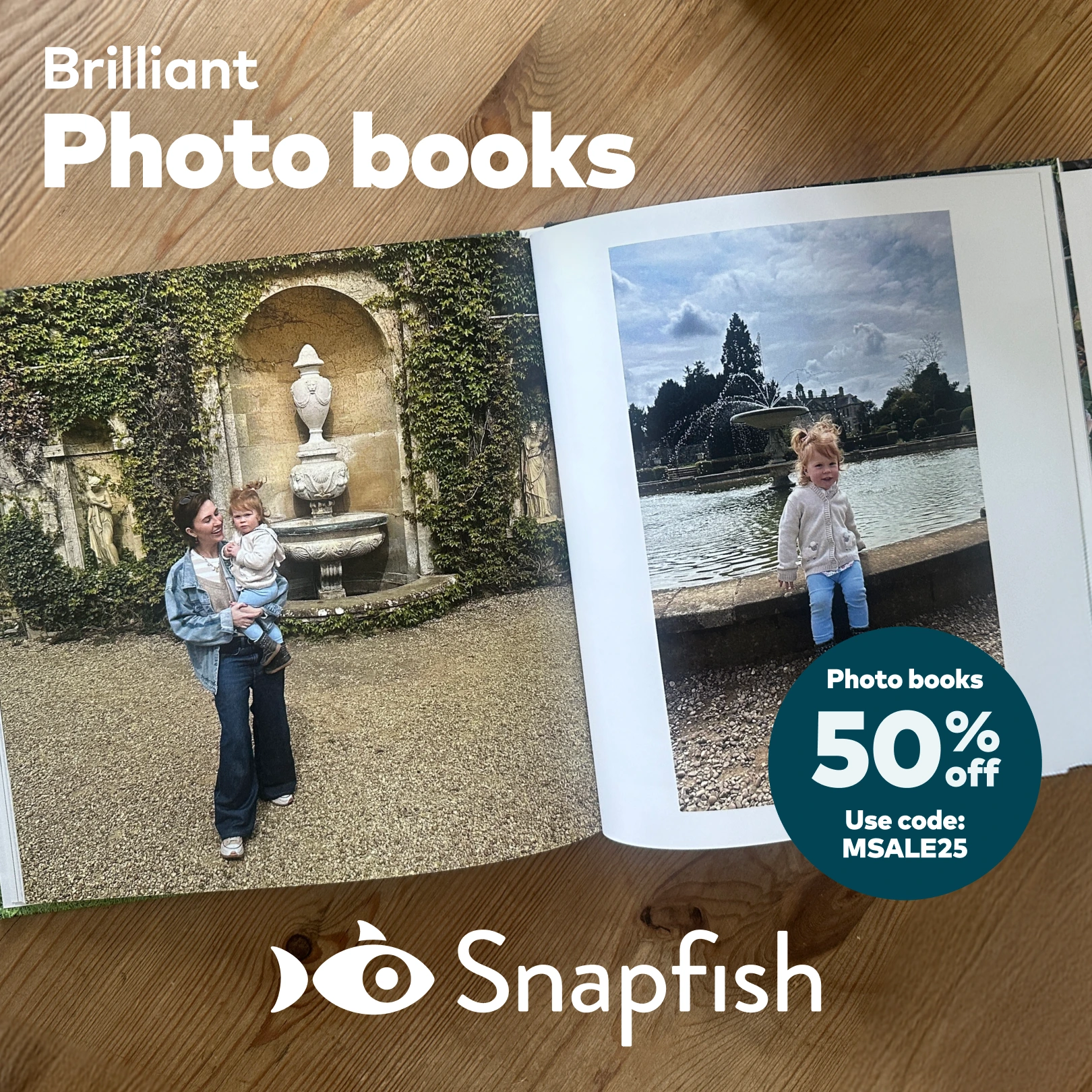
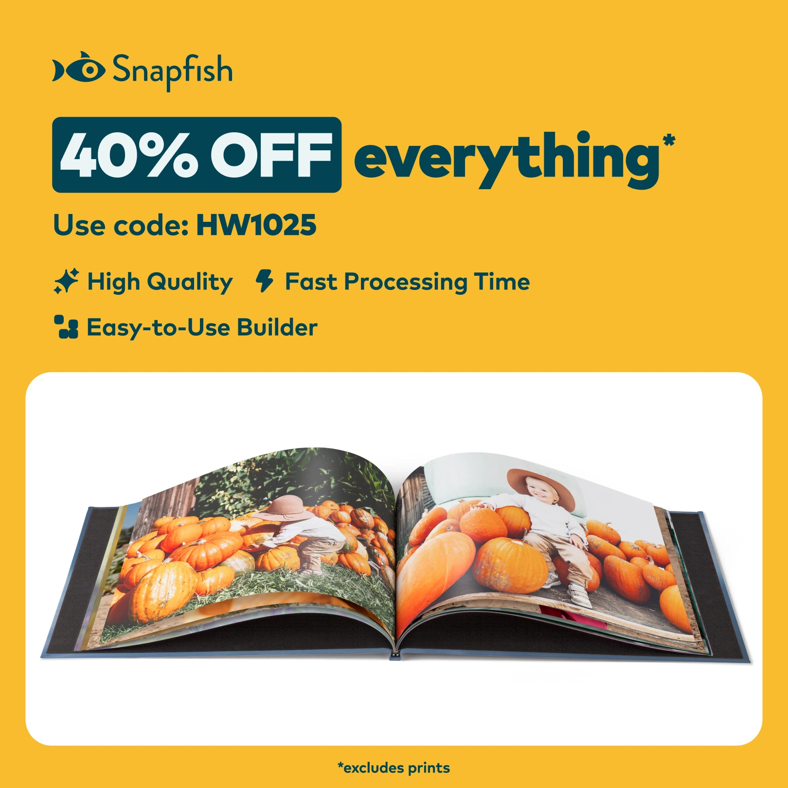
Alongside this, I designed offer-led static creative to support conversion-focused campaigns. These designs were intentionally simple, with clear hierarchy and messaging that could be quickly understood in-feed and work effectively alongside motion-based assets. Layouts were built to adapt across placements, allowing messaging and imagery to be updated without reworking the entire design.
One standout execution was a wrapped-style creative concept inspired by familiar annual recap formats. This reframed Snapfish products as a way to reflect on meaningful moments, positioning the brand around emotion and memory rather than focusing purely on the physical product.
Alongside this, I designed offer-led static creative to support conversion-focused campaigns. These designs were intentionally simple, with clear hierarchy and messaging that could be quickly understood in-feed and work effectively alongside motion-based assets. Layouts were built to adapt across placements, allowing messaging and imagery to be updated without reworking the entire design.
The result
The shift towards stronger brand application and emotionally driven static creative supported positive performance across paid social. Campaigns ran at seven-figure quarterly revenue levels, with paid activity delivering over £2.5M in revenue in Q1 alone while maintaining a ROAS of approximately 3.5 as spend scaled.
While overall investment was distributed across static, video, and UGC formats, the static creative contributed to this performance by supporting efficiency and brand recognition within the wider media mix. The work demonstrated how considered static design can play a meaningful role at scale, reinforcing emotional connection and performance when aligned closely with media strategy.
While overall investment was distributed across static, video, and UGC formats, the static creative contributed to this performance by supporting efficiency and brand recognition within the wider media mix. The work demonstrated how considered static design can play a meaningful role at scale, reinforcing emotional connection and performance when aligned closely with media strategy.