A suite of paid ad creatives designed to simplify complex financial offers, build trust, and support signups among business customers.
Client —
Allica Bank
Industry —
Finance
Allica Bank offers a range of business banking products, including high-interest savings, free business banking, and deposit-based benefits. This project was a creative-only engagement, with responsibility focused entirely on the design and delivery of paid ad creative.
I worked directly with the Allica team to produce ads that clearly communicated financial information in a way that was compliant, trustworthy, and easy to understand. The objective was to support signup activity through digital advertising while balancing financial accuracy with visual clarity.
I worked directly with the Allica team to produce ads that clearly communicated financial information in a way that was compliant, trustworthy, and easy to understand. The objective was to support signup activity through digital advertising while balancing financial accuracy with visual clarity.
The strategy
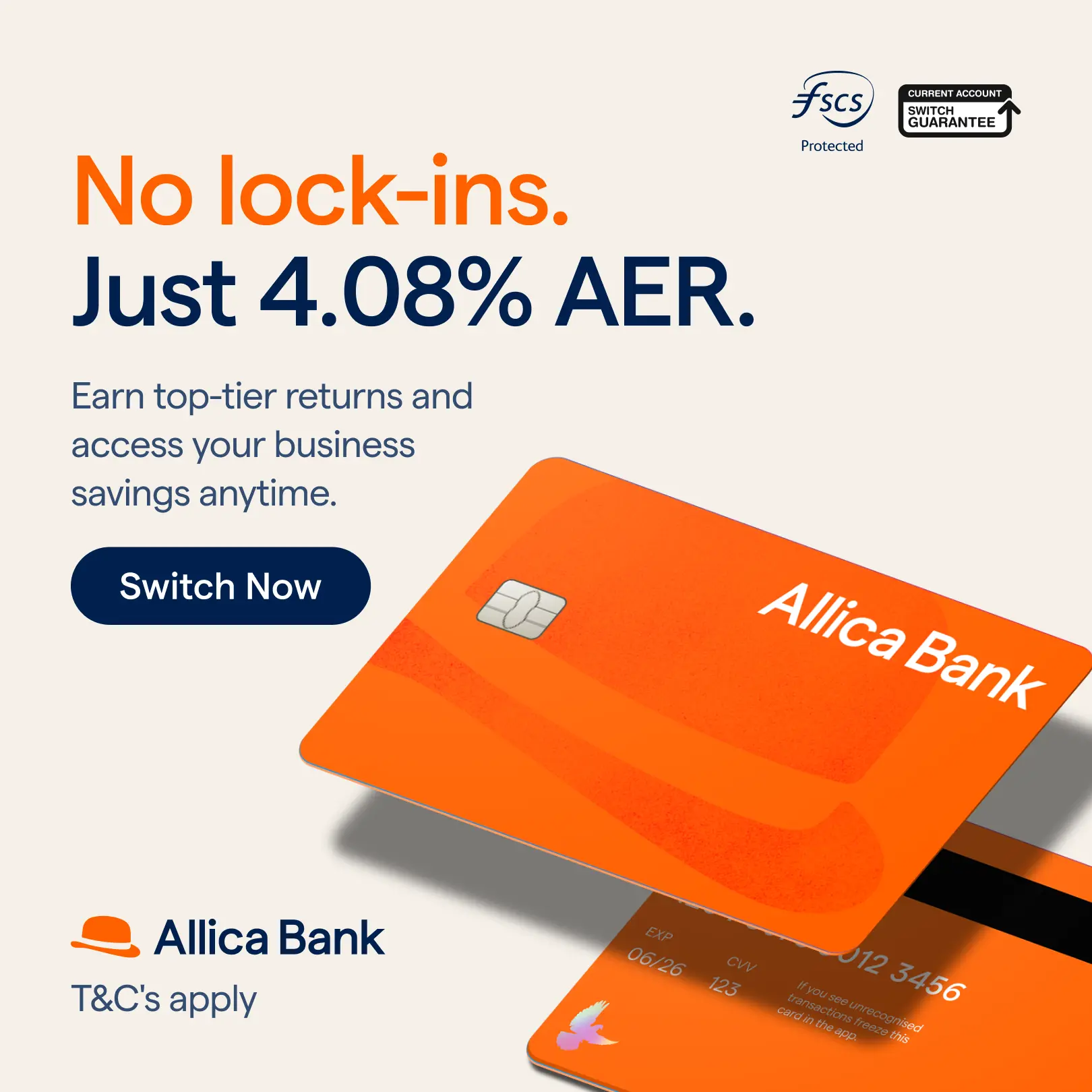
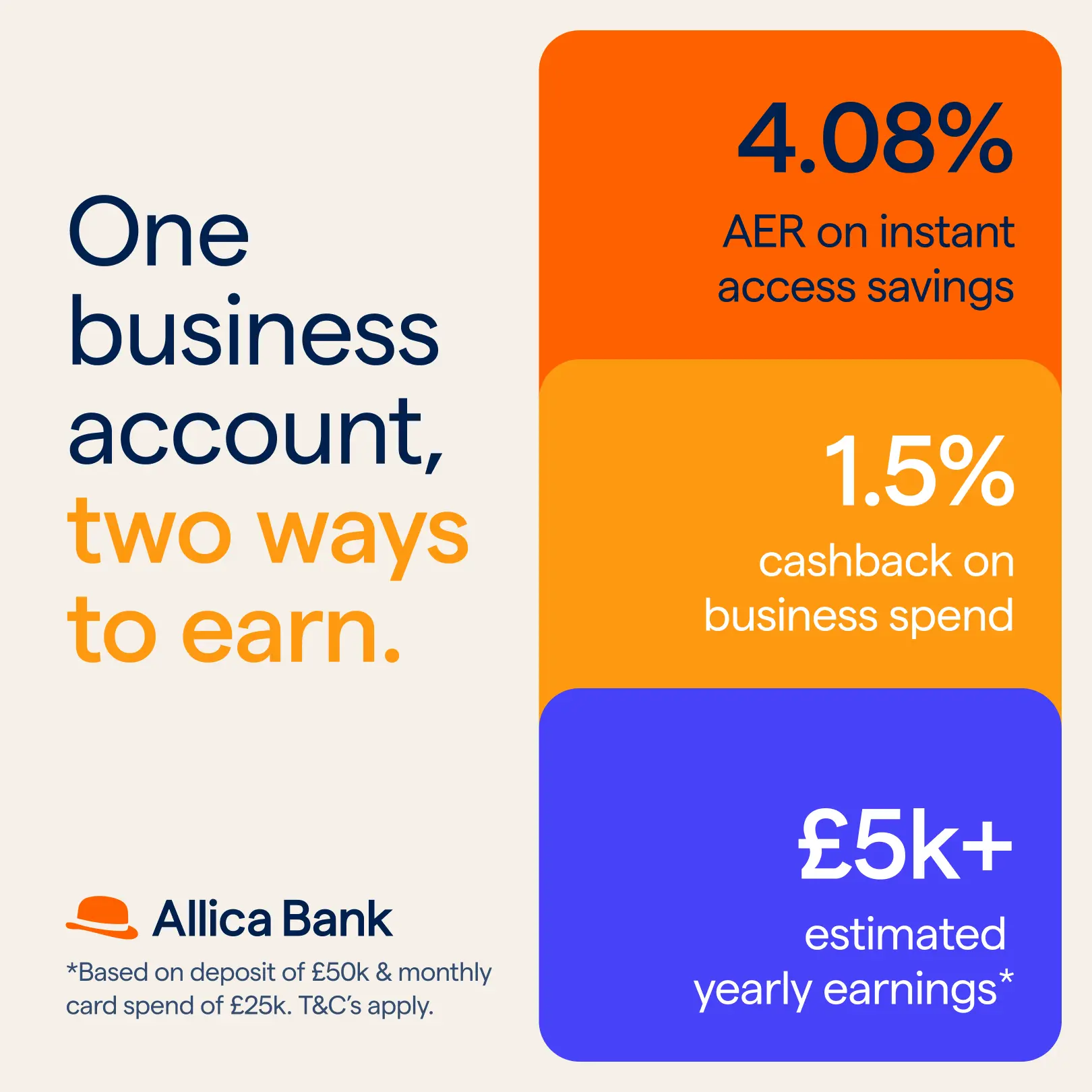
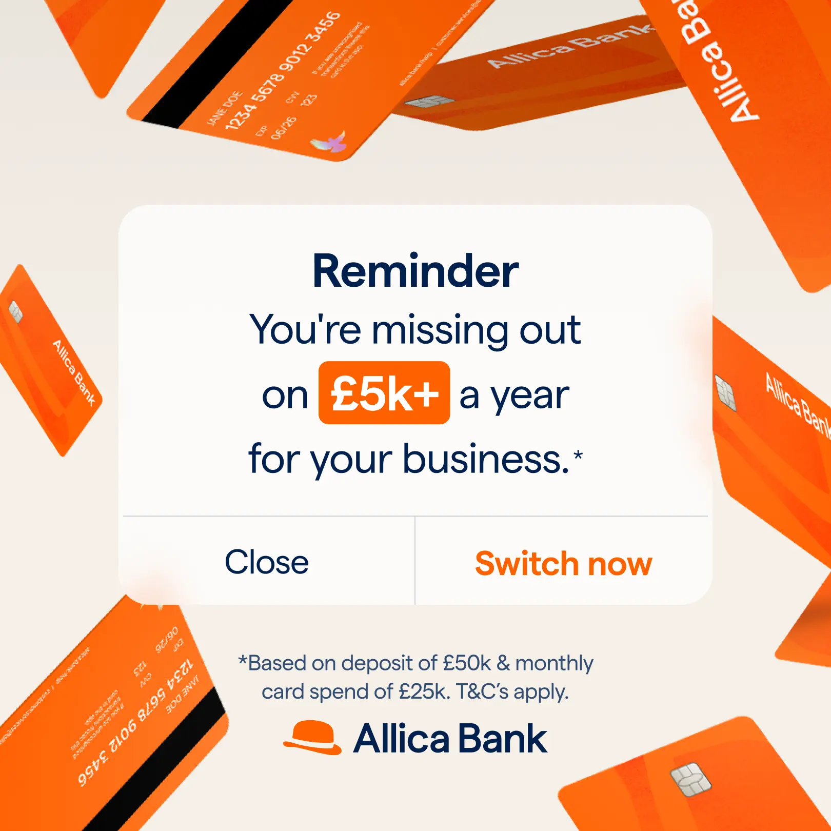
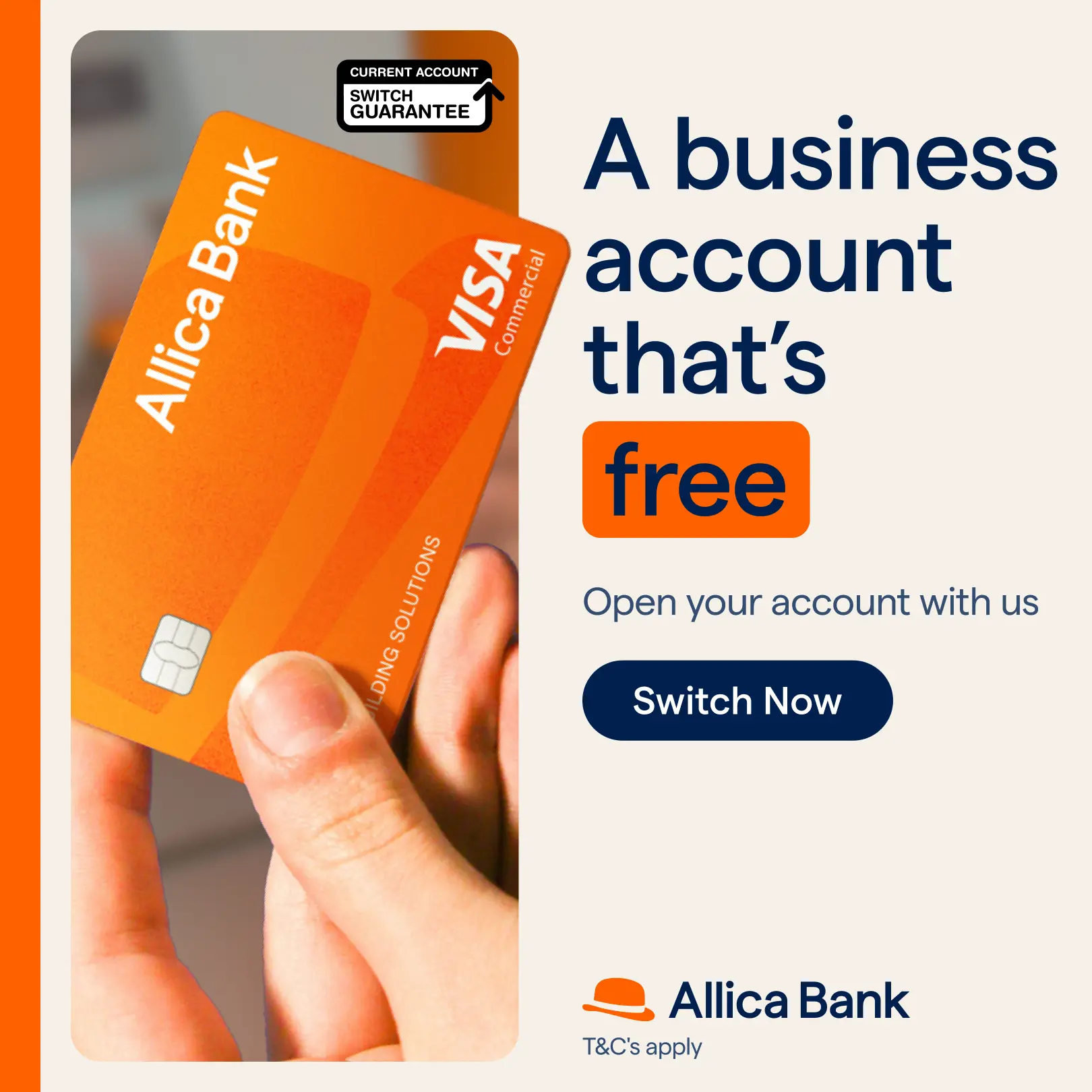
I produced a range of ad creatives highlighting interest rates, deposit benefits, and free business banking. Large, bold typography was used to bring key numbers forward, while layouts were simplified to reduce cognitive load and make information easy to digest at a glance.
I tested card-first imagery against text-first layouts to understand what built trust most effectively with business audiences. Card-first ads helped ground the offer in a tangible product, while text-led versions prioritised clarity and speed.
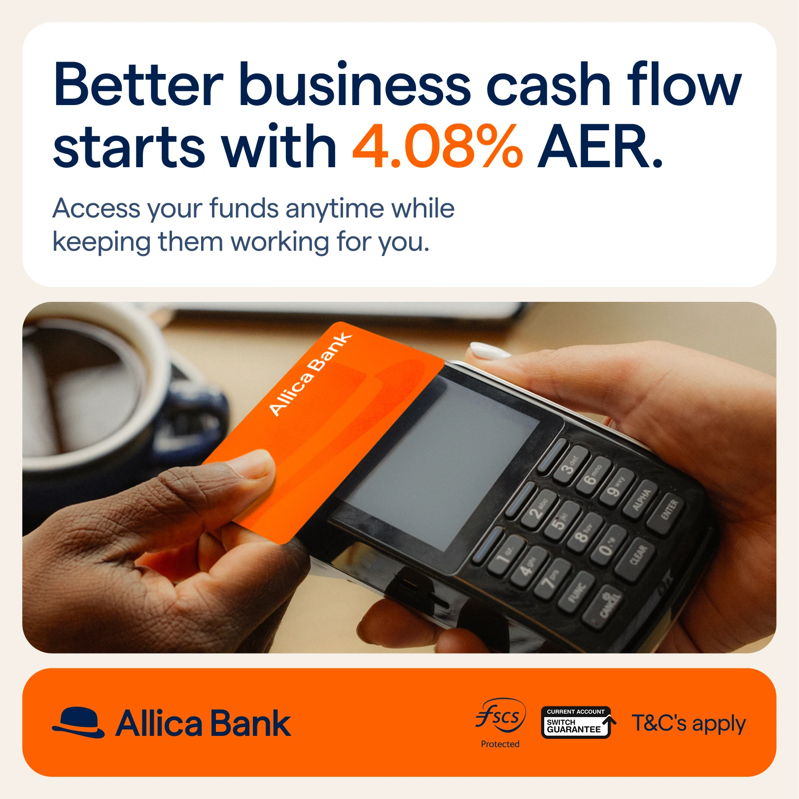
Alongside clean, minimal executions, I also created lifestyle-driven variants that placed Allica’s card in real-world contexts such as payment terminals or in hand. These added relatability without diluting clarity. Throughout the process, all creative was designed to remain flexible across placements while staying fully compliant.
I tested card-first imagery against text-first layouts to understand what built trust most effectively with business audiences. Card-first ads helped ground the offer in a tangible product, while text-led versions prioritised clarity and speed.
Alongside clean, minimal executions, I also created lifestyle-driven variants that placed Allica’s card in real-world contexts such as payment terminals or in hand. These added relatability without diluting clarity. Throughout the process, all creative was designed to remain flexible across placements while staying fully compliant.

My role
I worked as a digital designer responsible for all paid ad creative on the account. I communicated directly with Allica, taking ownership of creative execution from concept through to final delivery.
My role focused on translating product propositions into clear, compliant static ads, developing layout systems that could scale across placements, and ensuring all creative aligned with Allica’s brand and regulatory guidelines.
My role focused on translating product propositions into clear, compliant static ads, developing layout systems that could scale across placements, and ensuring all creative aligned with Allica’s brand and regulatory guidelines.

The approach
The work showed that ads built around clear interest rates and card-first imagery consistently supported stronger signup intent than more abstract or heavily styled variations. Messaging that prioritised transparency and value performed better than promotional language.
Ads using the word “FREE” generated higher lead volume, but signups were lower quality. This insight helped refine creative output and reinforce a focus on clarity over hype.
Overall, the ads supported increased conversions and helped position Allica Bank as a transparent and trustworthy banking partner for small and medium-sized businesses.
The result
I produced a range of ad creatives highlighting interest rates, deposit benefits, and free business banking. Large, bold typography was used to bring key numbers forward, while layouts were simplified to reduce cognitive load and make information easy to digest at a glance.
I tested card-first imagery against text-first layouts to understand what built trust most effectively with business audiences. Card-first ads helped ground the offer in a tangible product, while text-led versions prioritised clarity and speed.
Alongside clean, minimal executions, I also created lifestyle-driven variants that placed Allica’s card in real-world contexts such as payment terminals or in hand. These added relatability without diluting clarity. Throughout the process, all creative was designed to remain flexible across placements while staying fully compliant.