Using Meta Digital Marketing for Brand Testing in Sortara's Branding Journey

Unearthing User Preferences through Meta Brand Tests
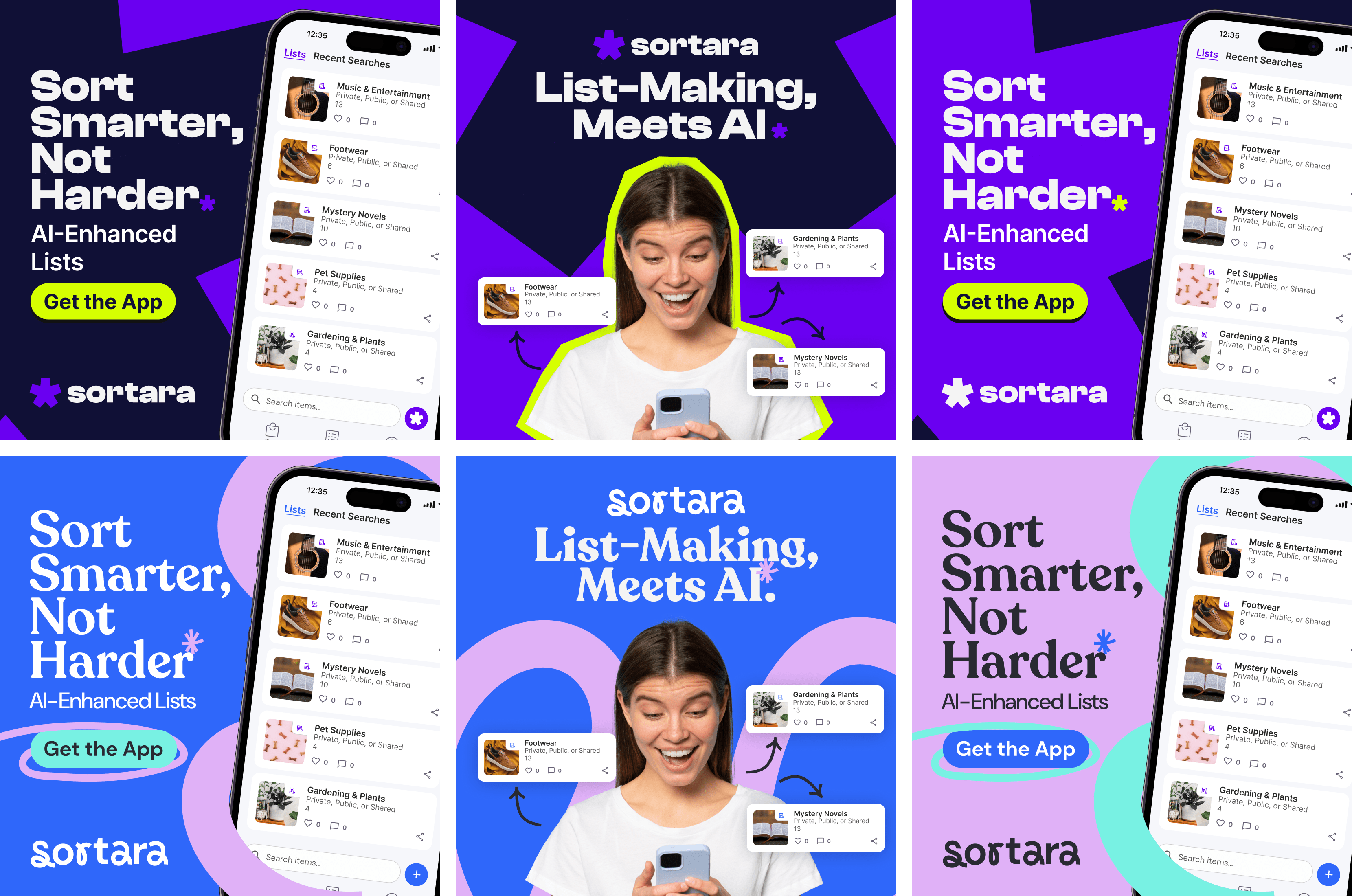
Our research into user preferences spurred the development of two initial brand concepts for Sortara. To evaluate these concepts, we employed Meta digital marketing platforms for A/B testing. Brand A (designed by myself), featuring a modern sans serif font and deep purple scheme, embodied Sortara’s tech-forward mindset. In contrast, Brand B (designed by Anna – a designer I managed) used a classic serif font and lighter palette, symbolising simplicity and transparency.
Meta’s platform allowed us to reach our target demographics effectively, run parallel campaigns for both concepts, and obtain real-time data. Analysing these results showed different age groups’ preferences: younger and older demographics gravitated towards Brand A’s darker theme, while middle-aged users were drawn to Brand B’s lighter tones. Interestingly, purple was universally appealing, while pastel tones were rejected.
Meta’s platform allowed us to reach our target demographics effectively, run parallel campaigns for both concepts, and obtain real-time data. Analysing these results showed different age groups’ preferences: younger and older demographics gravitated towards Brand A’s darker theme, while middle-aged users were drawn to Brand B’s lighter tones. Interestingly, purple was universally appealing, while pastel tones were rejected.
Influencing Sortara's App Design
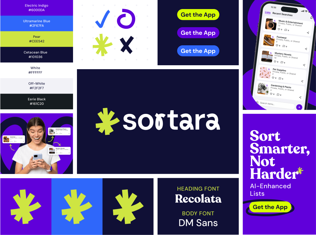
Armed with these key insights from Meta brand testing, I guided Sortara’s app design process. My consultations involved blending the preferred deep purple from Brand A with the serif font from Brand B that resonated with the mid-age group.
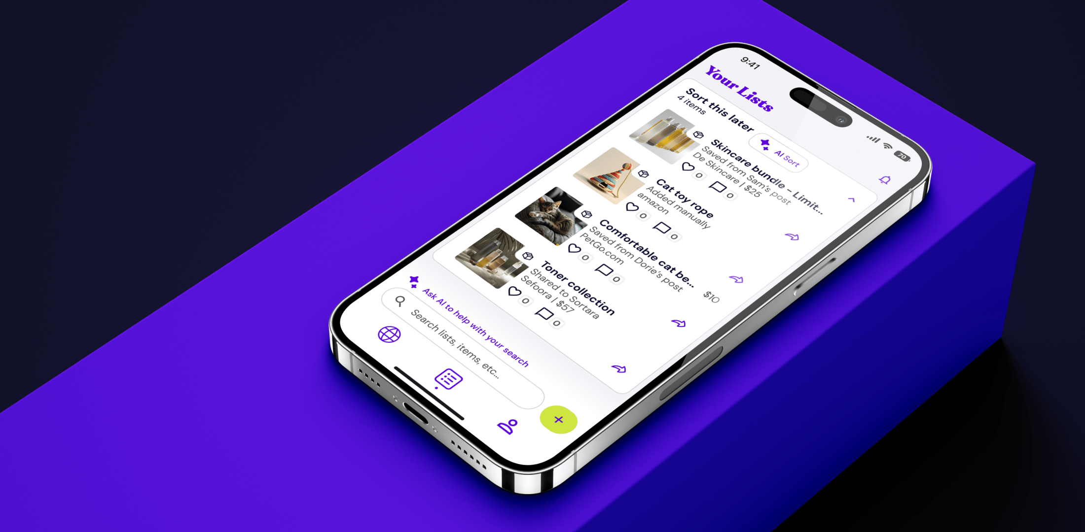
The design choices extended beyond just colour schemes to user interface and user experience. Keeping the data at the forefront, we ensured Sortara’s app layout was intuitive and appealing to a range of demographics. The final design successfully harmonised Sortara’s innovative nature with user-friendly aesthetics, delivering a universally appealing and intuitive app for our users.
The design choices extended beyond just colour schemes to user interface and user experience. Keeping the data at the forefront, we ensured Sortara’s app layout was intuitive and appealing to a range of demographics. The final design successfully harmonised Sortara’s innovative nature with user-friendly aesthetics, delivering a universally appealing and intuitive app for our users.


